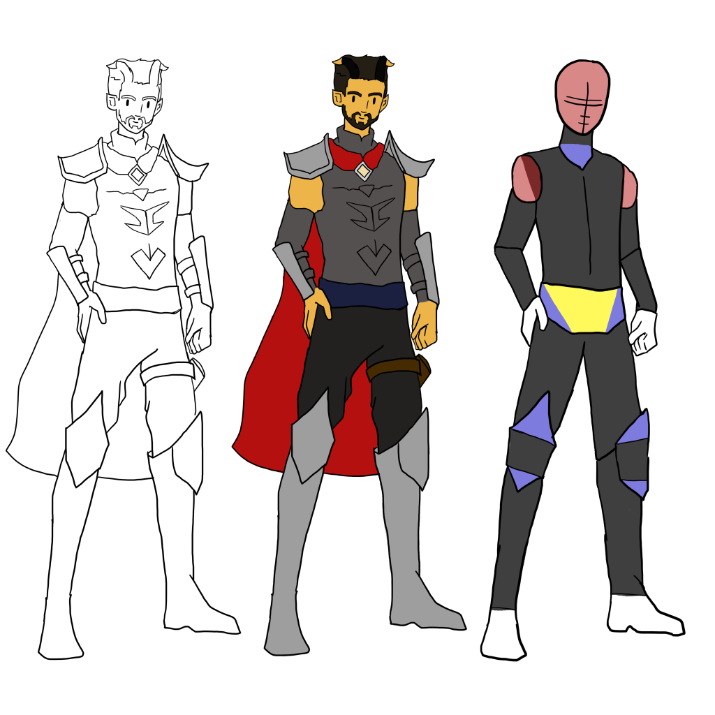
When exploring shape language and colour theory, I decided to use my Guardian character, Reed Hildryn, who I featured in my Initial Character concept post. I knew of the aforementioned theories, but never explicitly added them into my work prior to this, which led me to the decision of using a character that I am familiar with to explore new challenges.
SHAPE LANGUAGE
When I initially conceptualised the character of Reed Hildryn, I wanted him to be a character that was strong and could protect people; The emotions and personality that I wanted to present was a character that was warm and friendly but also was able to protect.
To portray this, the characters model is shown as being squares and rectangles as they can be associated with elements such as strength and rigidity. If the shape was a physical object on a surface instead of being a shape on a canvas or a piece of paper, one side of the square or rectangle would be constantly grounded – creating a solid base, whereas other shapes such as circles and triangles would roll or fall over sideways easily if they were pushed.
I used triangles to accent the topmost section of the character’s footwear, the section that covers the knee. The use of triangles as an accent to the character model and on elements of the characters chest piece helps portray the character as having an element of danger; the triangles can provide a sense of energetic movement, but can also portray danger through the sharp points of the shape.
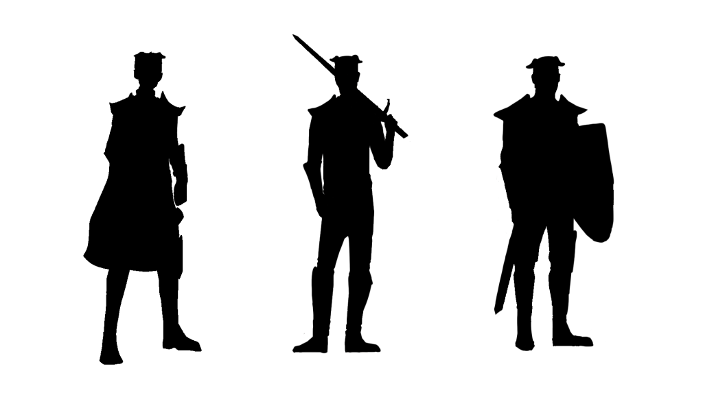
I also wanted to experiment with character silhouettes. Within animation, a long-standing rule is that a pose should be able to convey what the character is doing if the defining features are taken away – whether they are doing something extreme or whether they are simply standing there.
I wanted to create variations of the character’s basic standing pose that was shown in the character breakdown image, seen above. I selected the first outline image, transferred it to a new Photoshop canvas to ensure that I had enough space to experiment with different poses and props and then filled the pose using the paint bucket with a solid black colour. I felt that the first pose was easily definable that the character was stood there, but the pose had no interesting features to draw the attention of the viewer.
Furthering on my initial thoughts of the first pose, I created two more poses that involved the character holding weaponry. The second pose had Reed facing the camera with a sword resting on their shoulder, which can help the viewer to see that this character is armed whilst the third pose had him swap the sword for a shield.
I feel that the second pose is the cleanest and most interesting pose out of the three seen below. Poses one and three are drawn on a slight angle in relation to the camera, which makes the overall character become lost when adding in elements such as simple clothing, armour and props, whereas the second pose is drawn straight on in relation to the camera. The sword becomes a feature that draws the attention of the viewer, allowing the viewer to see that this character is armed based on their silhouette and potentially come to the conclusion that they have some form of military background, such as a soldier or a mercenary.
COLOUR CHOICES
Colour choices often have links to varying emotions and feelings. Characters that are implied to be stealthy and secretive in varying media, such as comic books and video games can often be seen in cooler, neutral tones creating the impression that they are able to hide in the shadows whereas characters who are the opposite to this trope are seen in warmer, brighter colours.
As mentioned above, I wanted the character of Reed Hildryn to feel warm and friendly, but also provide a feeling of protection. The character’s skin is specifically “Maximum Yellow Red”, which is a shade of yellow which often has connotations of warmth, happiness and energy when exploring colour theory (Morton, 2019). The colour of the cape also helps to add to the impression that the character is strong and protective as shades of red are often interpreted as being an extreme colour that is synonymous with danger, anger and adventure and also aids in drawing attention to the character rather than trying to divert it. (Morton, 2018)

FURTHER EXPLORATION – SPACE INVADER ASSETS
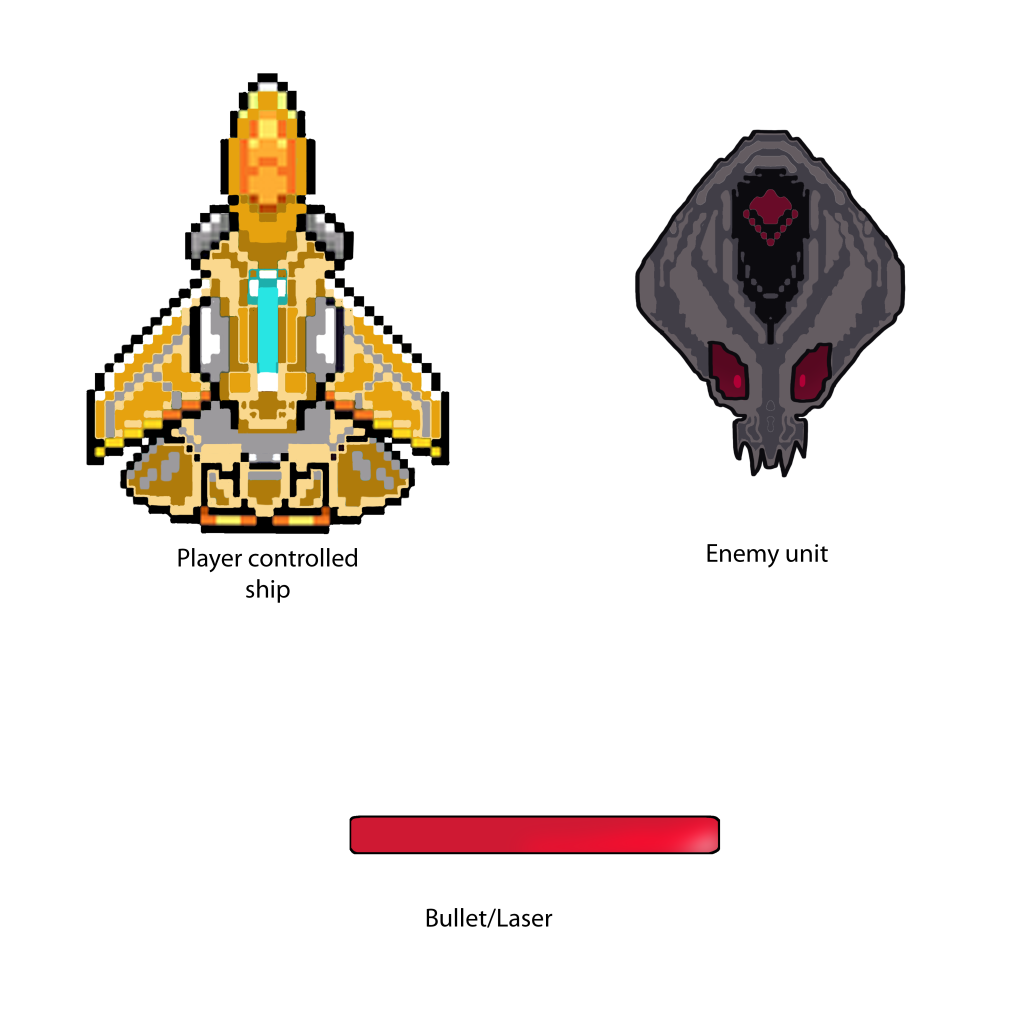
In the image below, you can see an asset sheet that I made for a Space Invaders inspired game, whilst also incorporating knowledge of shape theory into the designs of the player model and the enemy.
When I was creating these assets to be used in my Space Invaders inspired game, I wanted to keep some elements of Space Invader’s classic design. The enemies and the player models that are seen in the Space Invaders franchise are pixelated and small, which inspired me to transfer this aspect into my own designs. I created a pixelated effect by utilising the rectangular marquee tool on Photoshop and the paint bucket tool, allowing me to create pixelated sprites to be used in my game. I did attempt to use Photoshop’s pencil tool, but it did not show how I would have liked it too as the canvas size had large dimensions.
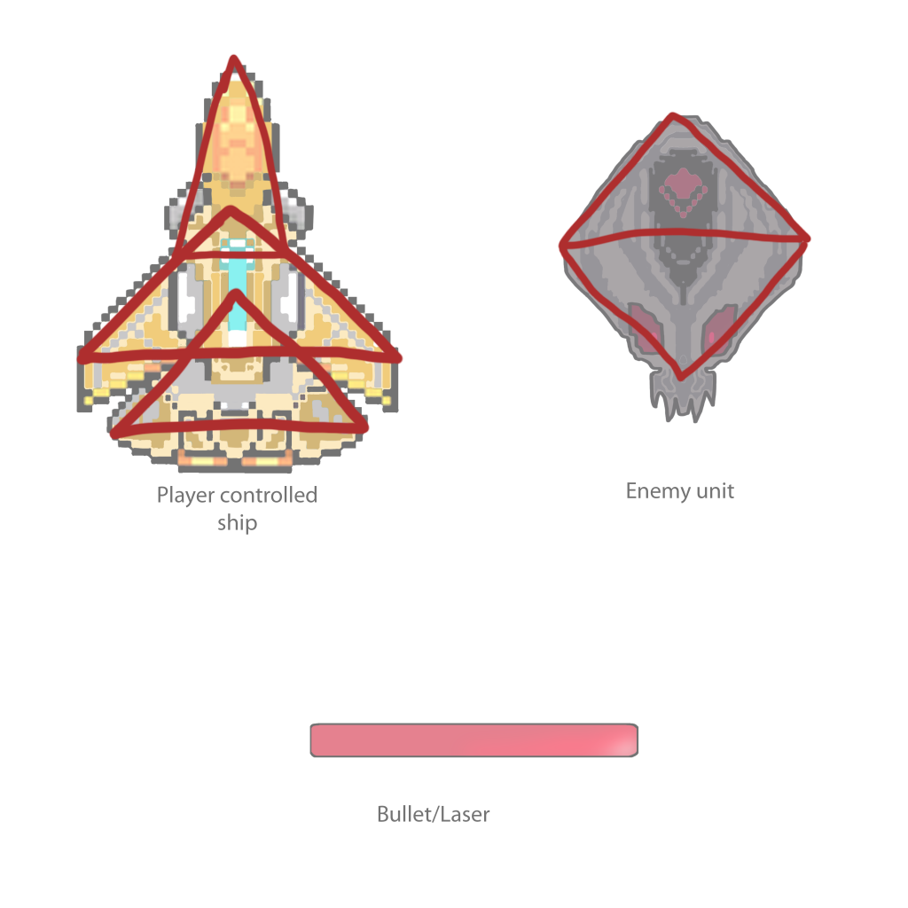
In regards to shape language, the spaceship that the player controls is primarily made up of triangles of varying sizes. This can predominantly be seen in the wings of the spaceship and nose. In contrast to my character design, I wanted a sense of speed and agility to be portrayed over strength and rigidity. The enemy unit is also predominantly made from two triangles, one pointing upwards and the other downwards. This helps to add a sense of danger to the enemy as it visually creates multiple sharp points that can pose a threat to the player.
I wanted the spaceship that the player controls to feel energetic and happy in comparison to the darker, more ominous colours of the enemy unit. I used varying shades of yellow and orange in the player’s ship to add to the feeling of speed and agility that was being portrayed through the use of triangles.
OVERALL
Overall, I am happy with what I have created. I was able to experiment with new theories and techniques that I had never used before in my work, such as blocking out a character pose to see whether they can convey their actions without any defining features and thinking about how we perceive various shapes in art.
Referenced Material:
Morton, J. (2018) Red. Colormatters.com. Available online: https://www.colormatters.com/the-meanings-of-colors/red.
Morton, J. (2019) Yellow. Colormatters.com. Available online: https://www.colormatters.com/the-meanings-of-colors/yellow.