This task saw us explore the different types of colour palettes, exploring how the colour schemes would convey different moods and how that would, in turn, affect the overall scene whilst also exploring camera work. This was an aspect that we needed to understand and consider when planning both the hero assets and the layout of our location (butchers), as certain colours may not fit within the theme and hinder the mood that we wanted to convey in the environment. Additionally, having a further understanding of composition, camera angles and various shots that could be used in the scene would aid us in the submission and rendering of our individual hero assets.
MONOCHROMATIC
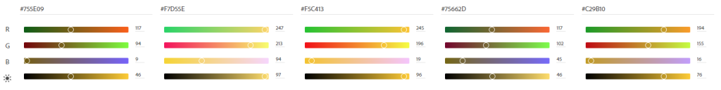
Monochromatic colour palettes are formed from one hue, with variations in the saturation and values to create different shades and tints. Using Adobe Color‘s colour wheel, it is easy to see the small differences between the shades.
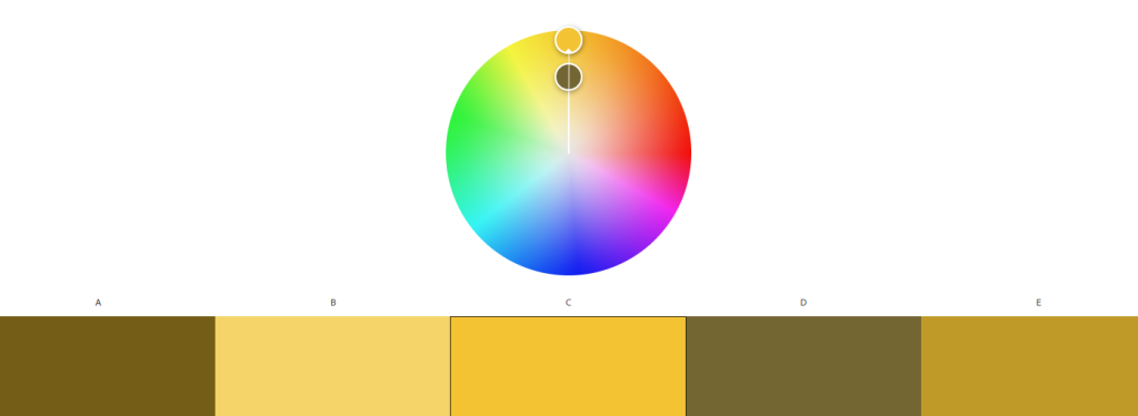
Monochromatic colour palettes can create a sense of unison and consistency when used within a piece, making items feel as though they belong in the piece. In the example colour palette seen above, the palette feels rather warm, inviting and friendly through the common connotations that Yellow holds.
For the Environment Design group project, if we wanted to create a relatively dramatic scene within the Butchers shop, such as it potentially having a darker storyline than simply existing as a shop, we would likely use a darker, cooler colour such as blue or a greyscale palette. Blue often has connotations with isolation and sadness (Cherry, 2005) whilst greyscale can invoke feelings of mystery (Smith, 2020), which would tie into a potential storyline.
ANALOGOUS
Analogous colour palettes are formed from one central colour (denoted by C) and proceeds to pick two colours to the left and right of the central colour accordingly (A and E). Additionally, in-between colours can be picked out to create a larger palette if required, which can be seen in colours B and D respectively.
My idea with this palette was based around rusting of metallic objects. As the theme for our location is Steampunk, metalwork is a prevailing feature within the genre – which creates the question of “How well kept is the equipment?”, as the equipment may be in a pristine condition or may be in need of repair. Through environmental storytelling, there is the potential that the equipment within the shop may be extremely old within a new age of machinery, with the older, potentially rusted equipment pushed to the side for a new replacement.
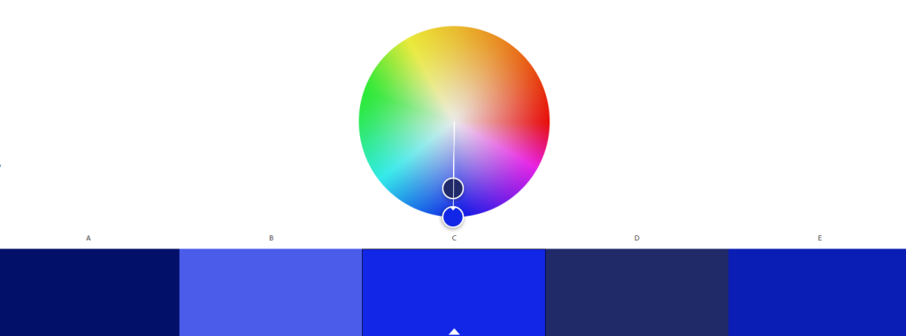
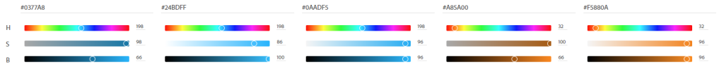
COMPLEMENTARY
Complementary palettes are composed of two different hues that are on opposite sides of the colour wheel, which can be seen below. From this, tints are chosen to create a palette that features strong contrasting colours.
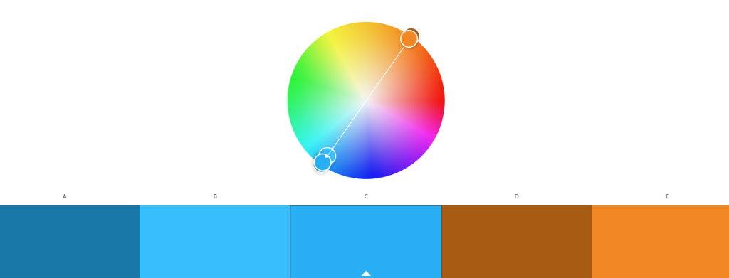
The blue tones seen in the palette above share the same hue value, which when paired with the orange tones that are directly opposite on the colour wheel paints an incredibly strong contrast of colours. If I were to use this palette, I would use the blue tones to act as the background colour and utilise the orange tones on aspects that I wanted to draw the viewer’s attention to. Blue is often regarded as a calming, neutral tone, which when paired with something as vivid as bright as orange, the viewer’s eyes will often focus on the bold colour, in turn, drawing focusing to specific areas.

Split complementary colour palettes feature a dominant colour paired with the two colours adjacent to the complementary colour. As seen in the colour wheel, the opposite to the blue tone would lie directly between yellow and orange, whereas in the example palette above, shades of orange and yellow have been selected. Split complementary palettes are subtle through the variations in the tones, yet retain the visual stimulation provided by using contrasting colours.
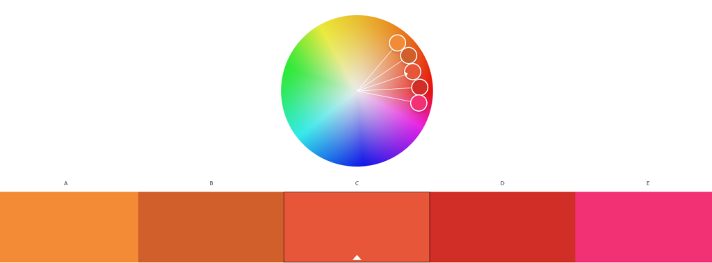
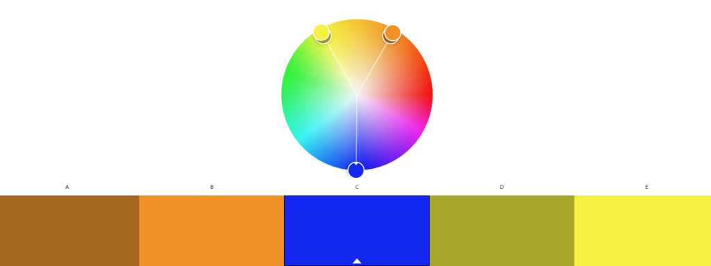
TRIADIC
Triadic colour palettes are formed from three equally spaced colours on the colour wheel, creating a palette of equal tone that can be seen in the example colour palette below. Triadic palettes are very lively and vibrant to view, yet can be very overpowering from the different high contrasting colours.
I imagine this palette being used to show a Halloween inspired scene, with the most vibrant colours being on a plastic item, such as a plastic pumpkin for trick-or-treating. If a character was designed with this palette, I would assume that the character’s nature is rather fun, open and relaxed rather than being serious and stoic. Discussions regarding the colour palette that we are using for our location have not occurred as of the time of writing, yet I highly doubt that the triadic colour palette will be our choice
COMPOSITION AND CAMERA ANGLES
Composition within visual media is an important aspect that needs to be considered. The composition of a piece can convey messages and feelings of a piece, which will help with the submission of the butcher’s environment. Additionally, knowing a variety of different camera angles and placements will be useful to showcase specific areas of the environment itself and the hero assets, enhancing the submission.
CAMERA ANGLES
Within visual media, the use of various camera angles and different shots can help to present to the viewer an entirely new environment or accentuate a fine detail on the surface of an item. I briefly explored different camera angles when creating a storyboard for the Art and Animation module, which would help me in rendering still images and recording animations for this submission.
Below are some examples of various camera angles and different shots that have been used in the 2021 Marvel movie, Black Widow (Marvel, 2021). Black Widow is one of my favourite movies, and upon recently rewatching it, I decided to use various scenes from the film as examples for camera work.
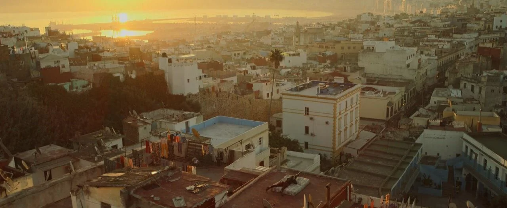
In the image above, an establishing shot is used to present the viewer to the environment of Morocco for the first time in the film. The rooftops are relatively empty aside from the outline of a character that can be seen in the lower centre of the frame, which makes the viewer question “Who is this person?” and “Why are they on a rooftop?”. This shot eventually transitions to a variety of close up shots, revealing the character, but at this moment the viewer’s focus is on this environment that they are being introduced to. Establishing shots such as this are not intended to provide the viewer with a highly detailed view of a specific building or of a street and are instead used to establish the size of an area. This shot is arguably taken from a birds-eye view when comparing the height of the camera versus the buildings that can be seen in the frame, highlighting the sprawling cityscape.
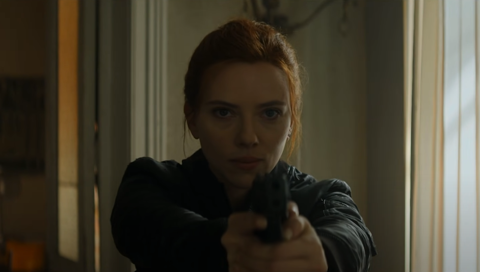
Another type of camera shot used in the film is the close-up shot, which provides the viewer with higher amounts of detail. We can see the emotions and expressions of the character in full view, whilst also seeing any other small detailing, such as small grazes and scratches along the sleeves of Natasha’s jacket. The weapon held in Natasha’s hands along with the background is out of focus, drawing the viewer’s focus to her facial features and her outfit rather than diverting it to multiple points in the frame.
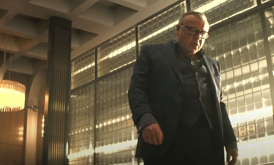
The camera angle of this shot is rather interesting to discuss, as the low camera angle is able to convey to the viewer that Dreykov, the main antagonist of the film, is an incredibly powerful figure. The camera is placed below the eye line and angled upwards, making him loom over it which aids in conveying to the viewer his power. Furthermore, the low angle provides a forced perspective, making Dreykov visually slightly bigger, potentially due to the proximity to the camera. The upshot camera angle places the viewer in a position where they are below the character in the frame, highlighting a clear power difference.
RULE OF THIRDS
One of the most common rules in visual media is the “Rule of Thirds”, which splits the frame into thirds horizontally and vertically. The rule of thirds draws the attention of the viewer to an area where the thirds of the frame crossover/overlap, which can be used to highlight a character’s emotion on a close shot or establishing a specific section of landscape to the viewer for the first time.
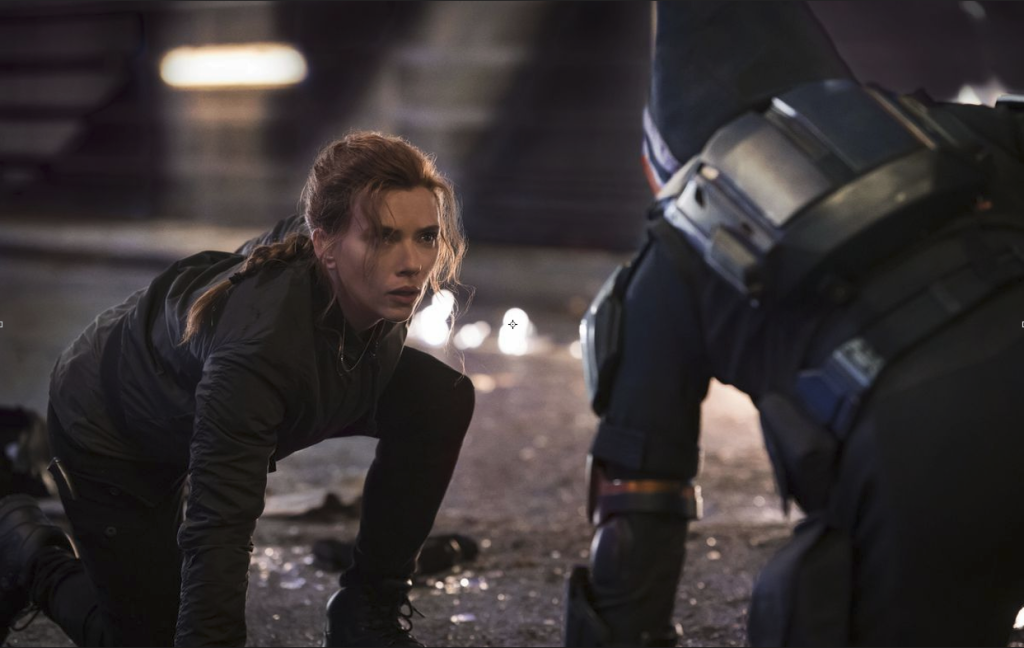
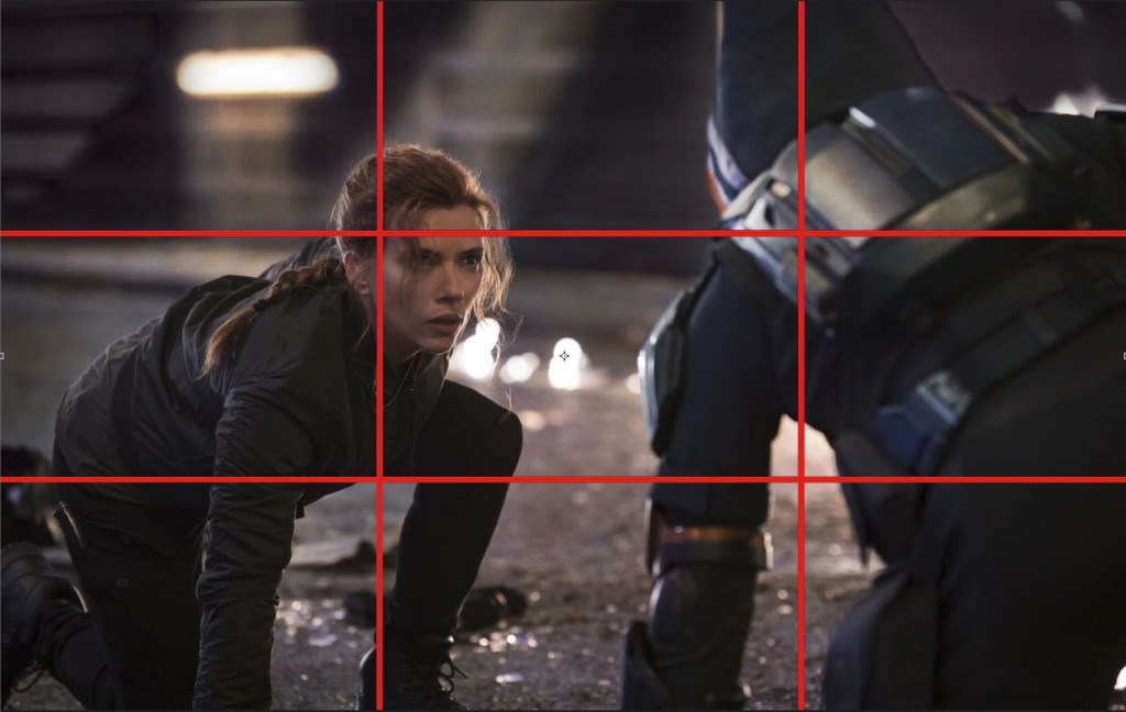
Below is an example of the rule of thirds used in a scene from Black Widow, featuring the protagonist, Natasha Romanoff, facing off against one of the antagonists in the film, Taskmaster. Natasha covers two crossover points on the left of the frame whilst Taskmaster covers the two crossover points on the right of the frame, showcasing both characters as equals to the viewer and conveying their strength. Neither Natasha nor Taskmaster has more of the frame covered and both cover the same amount of the frame, conveying to the viewer that these characters are equally as strong as each other.
Another additional example from Black Widow highlighting the rule of thirds can be seen below. This shot features the character of Yelena Belova who covers two overlap points and is visible within two-thirds of the frame. This shot conveys tension and stress to the viewer rather well through the use of a darker colour palette and framing the character within a narrow space, along with the character’s weapon being drawn level to the upper third.
At this moment, the viewer has no inclination as to who Yelena could be aiming her weapon at, as this unknown person is framed out of sight, with the viewer’s focus being drawn to the central third of the frame where Yelena is aiming. This makes the viewer start to ask questions such as “Who is it?” and “Is this a dangerous person?”. Furthermore, Yelena is shown to be in a relatively narrow space within this instance, unable to move into the room behind her and stuck between the opened doors and the closed window, seen in the right thirds, which further adds to the building tension and stress within the scene due to limited areas for the character to escape.
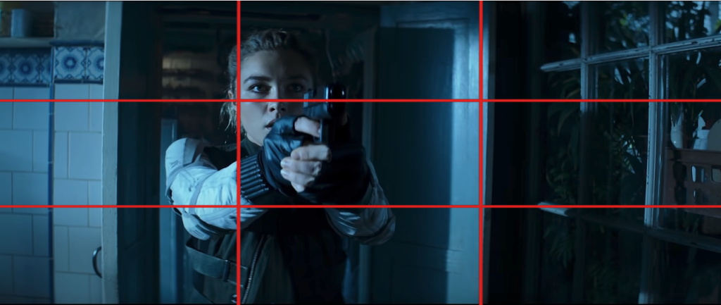
The colours used here are also important to discuss. Yelena’s outfit is bright in comparison to the rest of the scene, framed in the moonlight to create a pale blue overlay. The white of Yelena’s suit draws the viewer’s attention to her in the scene, highlighting the rigidity and motion of her hands and by extension, highlighting the weapon drawn. This may also be a subtle reminder to the viewer that Yelena’s character has changed from the character they were introduced to at the start of the film, no longer donning the black suit from her mind control and able to make her own decisions. The darker colours featured aid the tension and stress in the scene, with the various dark shades of blue acting as the shadows whilst the pale blue/white creates pops of colour to draw the viewer’s eye.

OVERALL THOUGHTS
Our environment will likely feature a monochromatic or complementary palette, as I personally feel that using a high contrasting colour palette such as a triadic palette would not fit within the location of a butcher’s shop.
For the render and animation of the hero asset, I would likely use a close-up shot or an extremely close shot to highlight small detailing, such as the wear and tear of a chain or gearwork and use a medium shot to capture the entire model.
Referenced Material:
Cherry, K. (2005) The Color Psychology of Blue. Verywell Mind. Available online: https://www.verywellmind.com/the-color-psychology-of-blue-2795815.
Marvel (2021) Black Widow (Movie, 2021) | Trailer, Release Date, & More | Marvel. Marvel Entertainment. Available online: https://www.marvel.com/movies/black-widow.
Smith, K. (2020) Meaning Of Gray: Color Psychology And Symbolism. https://www.sensationalcolor.com/. Available online: https://www.sensationalcolor.com/meaning-of-gray/.