Naughty Dog, the developing studio of the franchise The Last of Us, has been widely hailed as having some of the best level design in their game releases (Velde, 2021; Fiddis, 2021; Salter, 2022). The Last of Us and The Last of Us Part II are featured as the second and fourth best games respectively released by Naughty Dog according to Metacritic (Sharp, 2019), with the sequel in the franchise, The Last of Us Part II winning several awards, such as “EE Game of the Year” at the 2021 BAFTA Games Awards (Del Rosario, 2021) and both the “Game of the Year” and “Best Game Direction” awards at the 2020 Game Awards (Stedman, 2020). This essay aims to analyse the level design of the interior section of the Lakehill Seattle Hospital, touching on Naughty Dog’s use of Weenies establishing the surrounding location to the player, the use of light and colour to guide the player through difficult terrain and the use of narrow and wide sections in tandem with vision occluders to build tension in the player.
To provide context to this section of the game, the main character Ellie is seeking revenge against one of the antagonists in the game, Nora. Nora was involved in the murder of Ellie’s father figure and now Ellie seeks revenge for his murder in the post-apocalyptic United States of America.
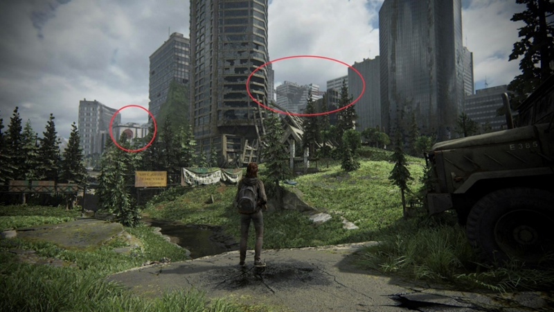
Naughty Dog’s use of Weenies in the early stages of gameplay helps to establish and foreshadow to the player the locations that they will be exploring without displaying user interface elements that would break their immersion. On the first day of controlling Ellie in the downtown section of Seattle, the player can see Lakehill Seattle Hospital along with the sky bridge that the player crosses when playing as the deuteragonist, Abby. The area seen below is open, with a few objects acting as guides to ensure that the player does not go too far in the wrong direction, such as the truck acting as a barrier that denies the player the ability to explore the area behind it. Naughty Dogs positioning of the hospital is a key element here, as the building acts as a landmark looming in the distance, giving the player something to aim towards; As mentioned in the Game Maker’s Toolkit video “Why Nathan Drake Doesn’t Need a Compass”, these buildings are a static position to aid in the players navigation through the level and ensure that the player will remain engaged in the pacing of the narrative (Game Maker’s Toolkit, 2015). In comparison to the surrounding buildings, both the hospital and the sky bridge are of a paler colour to the surrounding architecture, drawing the player’s eye to it. In addition, both landmarks are framed between surrounding buildings and use the ground as leading lines, with the river drawing the players eye to the left to the skybridge, whilst the hill in front of Ellie draws the players eye back to the hospital.
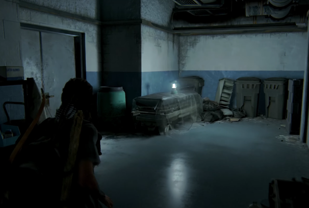
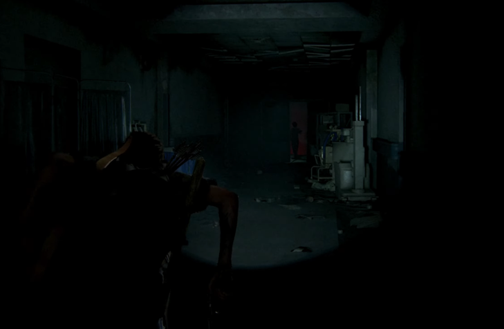
As the player progresses through the game to reach Lakehill Seattle Hospital, Naughty Dog uses light and colour to guide the player, acting as a breadcrumb for them to follow and to also remind them that they are not in friendly territory. As Ellie enters the hospital, the player is met with the dilapidated interior that is overrun by the opposing militia, the Washington Liberation Front (W.L.F). Seen in the image below, the only source of light in this area is the lantern on the gurney. Naughty Dog uses this lantern twofold in this area, adding to the environmental narrative that the W.L.F occupy the building and attracting the players attention to the surrounding area. In this small area, the light helps the player gather an ammo pickup that is placed on top of the box in the far right along with additional crafting materials that could have been missed if they do not investigate the space.
The environment has scraps of paper strewn about, filing cabinets thrown aside and the place feels cold and unwelcoming to the player, partially through the combination of the pale, cold light emitting from the lantern and how that reacts with the blue colouration of the walls. Blue is often viewed as a positive colour with connotations to calm, focus and cleanliness (Dhar, 2016 and York Graphic Designers, 2012) which is counteracted due to the one light source. Linking to “In pursuit of Better Levels” by Tychobolt, hospitals are stereotypically seen as a safe place from the inclusion of bright lights and calming, non-aggressive colours, whereas the limited light source seen below creates a dark atmosphere (Tychobolt, 2020); this creates a sense of unease due to it going against the stereotype and reminds the player that they are not in familiar territory and danger is around – both in the form of the W.L.F and the infection. In addition to the hospital feeling cold and unfriendly, the only clean items that can be seen as the player explores are items brought by the W.L.F, such as the black military-style crates and the lanterns. This could purely be coincidental, with them acting as prop that the player was not meant to pay direct attention to or alternatively, it could be a gentle reminder to the player that they are not alone and that the Washington Liberation Front has control of the building.
The use of the lantern and the light emitted to direct the player is repeated within the subsequent chase sequence with Nora. The areas that the player passes through in this chase sequence vary in their shape and sizing, with some of the areas being long narrow hallways and others being wide open spaces with limited cover. One of the sections in this chase has the player navigate from a narrow hallway, with only one entry and exit point and into a wide, open room, revealing a portion of the W.L.F occupying the building. Upon entering, the player is attacked from enemies in a higher vantage point, forcing the player to quickly move through the area or risk starting over. Naughty Dog’s variation in the shape and sizing, along with multiple entry points into the adjacent rooms helps to build and heighten the players tension at possibly losing Nora’s position whilst keeping the gameplay enjoyable with the changes in each room; Referring to Max Pears “Let’s Design: Exploration”, the player’s engagement is maintained in this sequence as they are not constantly moving in a straight line, which would create monotonous gameplay and instead have to manoeuvre through the spaces, utilising mechanics such as jumping and breaking sections of the environment (Pears, 2021).
As the player is giving chase, Naughty Dog has the player move through areas that have different levels of light intensity, which when added with the different room layouts and potential obstacles may mean that a player may enter the area too slowly and miss the direction of the chase; This creates a confusing gameplay experience for the player and can result in the player losing interest due to the challenges presented. The lanterns position directly opposite the doorway helps the player see the next room that they need to move towards without the addition of UI elements, such as a text prompt or a beacon. As mentioned in the GDC “Level Design Workshop: Blockmesh and Lighting Tips” talk by David Shaver and Robert Yang, players are instinctively drawn towards light and Naughty Dog have used the lanterns to light the critical pathway that the player should be travelling on (Yang and Shaver, 2018). The contrast between the dark atmosphere and the light being emitted from the lantern drives the player to move towards a visible area rather than remain in the dark.
Additionally, as the player progresses down the hallway, there is light emitting from behind the doors to show the direction of the chase. Naughty Dog goes against the player’s instincts to give chase through the door with denied affordance, as the door becomes blocked upon the player reaching it. The player physically cannot proceed in this direction, as Ellie steps back from the door and is reinforced with an audio cue of “Damn it!” to further guide the player into finding an alternative route.
Naughty Dog use of vision occluders throughout the level helps to maintain and further add to the player’s tension. Referring to Tommy Norberg’s discussion, Naughty Dog breaks the players sightline with Nora when the players view is limited, which in turn makes the player fear that they have potentially let Nora escape, which in turn helps to build the players tension and engagement (Norberg, 2022). Primarily, this was seen when moving through corridors in the level, as the doorframe and wall blocked the players view into the location until the player model was beyond the threshold of the doorframe.
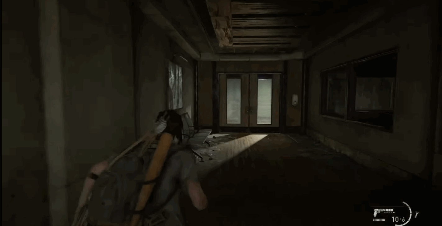
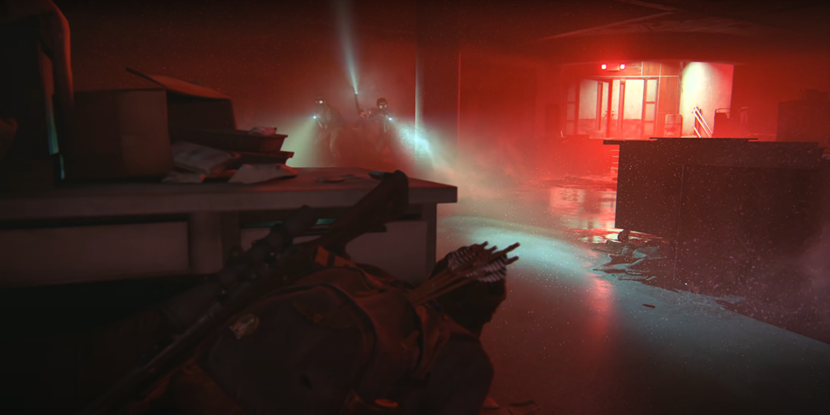
As the player progresses through the environment as the chase continues, there is a transition in the lighting of the area. In the larger areas discussed above, the player is guided by lanterns to continue the chase due to the multiple ways the player can enter certain rooms. As the player continues, the areas become progressively narrower with a single-entry point and an exit point, effectively creating a direct path to follow. This results in the lighting in the scene to switch from the use of the lanterns to the flashlight mounted to Ellie’s backpack. Furthermore, the layout of the hallway, seen below, focuses the player’s attention on the task at hand – catching Nora, who is framed in the centre of the player’s screen. In comparison to the earlier segments of the level, this is a clear target for the player; The player does not have any items to vault over, break through or manoeuvre past, which would distract them and force the use of lanterns to guide the player – there are very minimal distractions to the player from the environment and the target of the chase is framed in the centre from the architecture within and bathed in red light.
A point to note is how Naughty Dog uses the red light coming from below, breaking up the repeated dimmed atmosphere that the player has been exploring through. Red typically is compared to being a warning of danger, violence and anger (Chapman, 2010), which when used in this section reminds the player that the WLF is not the only danger here and highlights Ellie’s emotional state.
This section of the environment reminds the player of the external danger of the Cordyceps virus, visibly showing the player the WLF wearing gas masks, along with having visible spore particles in the cone of light that is emitting from the WLF soldier, reminding the player that they are in an infected area. A similar pale light to the ones emitted from the lanterns is seen near the fire door, which is partially ajar, leading the player to infer the direction that Nora escaped through. Once the player navigates the area beyond the doors, the player is shown a cutscene including Nora, reaching the peak of the pacing curve in the game (de Fault, 2020).
Naughty Dog creates a gameplay experience that keeps the player engaged through the challenges and locations presented, highlighting and foreshadowing areas that the player will later visit from the early stages of gameplay whilst also having sequences that build tension for the player through the use of vision occluders and the possibility of losing Nora’s position during the chase sequence. These sequences also work in tandem with Naughty Dog’s use of light, as this ensures that the gameplay does not become too confusing for the player and that they are continuously moving in the correct direction even when visibility is limited.
Referenced Material:
Chapman, C. (2010) Color Theory for Designers, Part 1: The Meaning of Color. Smashing Magazine. Available online: https://www.smashingmagazine.com/2010/01/color-theory-for-designers-part-1-the-meaning-of-color/#:~:text=Red%20(Primary%20Color)%20%23&text=It. [Accessed 11 Nov. 2022].
cyniic. (2020) Ellie confronts Nora at the Hospital + Chase Scene – The Last of Us Part II.
Available online: https://www.youtube.com/watch?v=hJyGL1rCe3w&t=119s [Accessed 22 Oct. 2022].
de Fault, A. (2020) Intensity and pacing in The Last Of Us: Left Behind. Wireframe magazine.
Available online: https://wireframe.raspberrypi.com/articles/intensity-and-pacing-in-the-last-of-us-left-behind [Accessed 11 Nov. 2022].
Del Rosario, A. (2021) BAFTA Games Awards: Supergiant Games’ ‘Hades’ Takes Home Top Prize – Complete Winners List. Deadline.
Available online: https://deadline.com/2021/03/bafta-games-awards-2021-hades-takes-home-top-prize-complete-winners-list-1234721128/ [Accessed 1 Nov. 2022].
Dhar, S. (2016) Why hospitals are blue and pencils yellow – Times of India. The Times of India.
Available online: https://timesofindia.indiatimes.com/home/sunday-times/why-hospitals-are-blue-and-pencils-yellow/articleshow/51474209.cms [Accessed 9 Nov. 2022].
Fiddis, R. (2021) Top 5 Best Level Designs in The Last of Us Part 2. DualShockers.
Available online: https://www.dualshockers.com/top-5-best-level-designs-in-the-last-of-us-part-2/ [Accessed 27 Nov. 2022].
Game Maker’s Toolkit (2015) Why Nathan Drake Doesn’t Need a Compass | Game Maker’s Toolkit.
Available online: https://www.youtube.com/watch?v=k70_jvVOcG0. [Accessed 5 Nov. 2022].
Norberg, T. (2022) https://twitter.com/the_norberg/status/1479163224385851392/photo/1.
Available online: https://twitter.com/the_Norberg/status/1479163224385851392/photo/1 [Accessed 10 Nov. 2022].
Pears, M. (2021) Let’s Design: Exploration. 45–46.
Available online: https://www.lulu.com/shop/max-pears/lets-design-exploration/paperback/product-zerwr7.html?page=1&pageSize=4. [Accessed 11 Nov. 2022].
Salter, J.K. (2022) 10 Video Games With The Best Level Design. TheGamer.
Available online: https://www.thegamer.com/video-games-with-the-best-level-design/ [Accessed 27 Nov. 2022].
Sharp, N. (2019) The 15 Best Naughty Dog Games (According to Metacritic). Game Rant.
Available online: https://gamerant.com/best-naughty-dog-games-metacritic/ [Accessed 22 Oct. 2022].
Smyth, L. (2022) The Last of Us 2 Fan Points Out Incredible Skybridge Detail. Game Rant.
Available online: https://gamerant.com/last-of-us-2-skybridge/ [Accessed 22 Oct. 2022].
Stedman, A. (2020) The Game Awards 2020: Complete Winners List. Variety.
Available online: https://variety.com/2020/digital/news/the-game-awards-winners-list-2020-1234850547/. [Accessed 2 Nov. 2022].
Tychobolt (2020) LD – In pursuit of better levels. Google Docs.
Available online: https://docs.google.com/document/d/1fAlf2MwEFTwePwzbP3try1H0aYa9kpVBHPBkyIq-caY/edit. [Accessed 2 Nov. 2022].
Velde, I. van der (2021) Uncharted: The Lost Legacy Has Perfect Level Design. TheGamer.
Available online: https://www.thegamer.com/uncharted-the-lost-legacy-level-design/ [Accessed 27 Nov. 2022].
Yang, R. and Shaver, D. (2018) Level Design Workshop: Blockmesh and Lighting Tips – YouTube.
Available online: https://www.youtube.com/watch?v=09r1B9cVEQY. [Accessed 11 Nov. 2022].
York Graphic Designers (2012) Colour Theory – The meaning of colour | What do colours mean. York Graphic Designers.
Available online: https://yorkgraphicdesigners.co.uk/colour-theory-part-1-the-meaning-of-colour/#:~:text=Blue%20represents%20reliability%2C%20cleanliness%2C%20trust [Accessed 5 Nov. 2022].