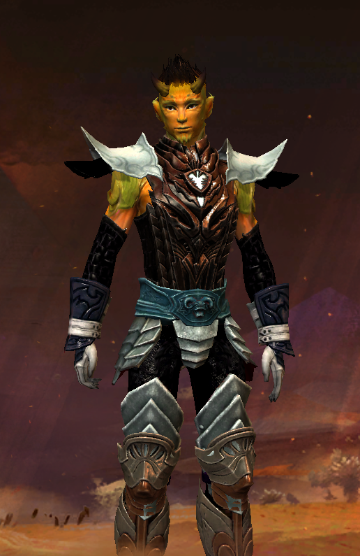
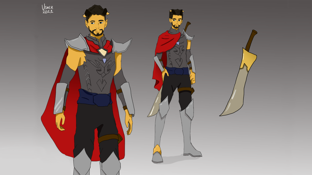
The image seen below is my Guardian character, Reed Hildryn, from the MMORPG Guild Wars 2. I used his character to experiment with elements that I don’t often draw, such as experimenting with the physics of materials such as a cloth cape, which might gather in certain areas in relation to the characters overall build or in relation to the position they are stood in, as this would create areas of shadow from folds in the material.
INSPIRATION
As mentioned above, the character that I am including in this initial piece is my Guardian character from the game Guild Wars 2, who was inspired by my Dungeons and Dragons paladin character. The outfit seen in this piece is a close representation of some of the armour in the game for the Guardian profession, which was interesting to draw due to the varying shapes that make up certain armour pieces, such as the chest plate that is seen in the screenshot below which is comprised of an amalgamation of varying triangular and rectangular shapes layered on top of each other.
DRAWING THE PIECE
In this piece, I wanted there to be two views of the character, a full body render that could show the characters stance and a three-quarter render that could show some detailing on armour pieces, such as the chest plate. When I was creating the full body render, I also decided to include a weapon to add another challenge to my drawing – as I normally try to avoid drawing and shading weaponry due to inexperience.
This drawing is one of my drawings that has a relatively normal rendering of shadows, making use of Photoshop’s blend modes, gradient tool and smudge tool to do so. I do not have much experience with the blending modes and tools on Photoshop, but I experimented on elements of the outfit such as the gauntlets, chest pieces and sword to attempt to give it a metallic shine, matching the respective material.
FURTHER EXPLORATION
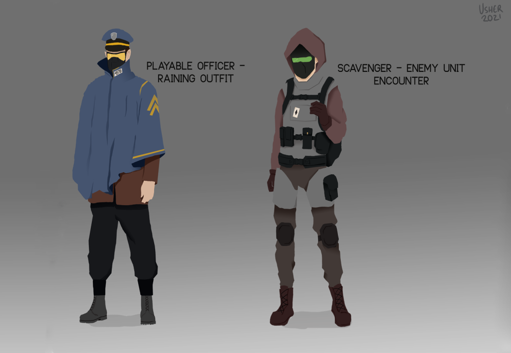
I decided to take this task further by creating initial concept artwork of characters for a dystopian, futuristic horror game. I decided to create two characters that could be of different factions to ensure that I could practice different outfits whilst working with colour palettes.
I wanted the colour palettes used in this piece to be rather neutral, cooler colours rather than warm and bright. The first character, the playable officer, has a colour palette of blue, brown and black – with the highlighting colour being yellow, which draws attention to specific areas of their body, such as the visor section of the mask and the insignia on the sleeve of the poncho. The outfit of the scavenger has a similar colour palette composed of varying shades of brown and grey, with the highlighting colour being green to draw attention to the head.


I experimented with different ways to render shadows, such as on the officer’s poncho and under the scavengers vest, ultimately deciding to render the models using Photoshop’s gradient tool and blend modes. I also decided to draw the concepts without black line art seen on my first piece, which I feel made the piece cleaner as the colour was allowed to come through without being contrasted by harsh black lines.
OUTCOME
Overall, I’m rather happy with how these pieces have come out. I experimented with elements that I don’t normally include in my artwork, such as how a cape or a poncho would fall and gather at certain points based on how a person’s stance or whether it would fall differently in relation to other aspects of their outfit.
I could have potentially improved these pieces by attempting to include realistic lighting and shading on the outfits, as during the process of creating both images I did not particularly think about shading realistically. As an example, the playable officer has shading that is seen on the brown undershirt, which is not carried all the way and does not transition between the values – the shade is a solid line whereas realistically this would gradually transition and diffuse across the material.